fbpx

Published June 20, 2024 . 7 mins read

Projected Final Cost gets a makeover

When ProNovos was created, its original philosophy, the one that we still follow whenever we create something, was to provide actionable insights for contractors to build on. We started with a simple data extraction from ERP and getting this information into a visual format so that it is easier for companies to spot trends and focus on what matters to them, hence reducing the time to make a decision.

The concept of the Projected Final Cost tool was born out of a desire to solve one of the core problems in construction: accurate forecasting of project costs from start to completion. The question on our minds was: how can we give contractors the ability to not only report but also predict their costs? Additionally, how could we enable them to update line items and let them see the immediate impact on the project’s profit margin?

There was nothing like this on the market before, and this is one of the things that excites me the most about working at ProNovos: the opportunity to challenge and redefine the norms of construction financial management. But it was also a bit of a gamble: is this something that contractors really need? Are they better off sticking with traditional tools, even though they are filled with uncertainty and require manual estimations?

The response that we got exceeded our expectations: it quickly became our second most used feature, only preceded by the WIP.

It’s now been 2 years since the initial release of the Projected Final Cost tool. We have learned some lessons, listened to our users, and realized it was time for the module’s makeover.
Xenia Leshchenko
Product Designer,
ProNovos

Everything, all at once

When we initially released the tool, we wanted to capture as much functionality as possible on a single screen: lump sum breakdown, hours estimate, quantities, labor rates — everything that a contractor might find useful to project their cost at completion.

As you know better than we do, in construction there is no one-size-fits-all when it comes to running a business. Our experience working with construction companies and engaging with users has revealed that each company operates slightly differently. Although business models may appear similar at a high level, it is the subtle nuances that underscore the importance of offering a platform customizable to each company’s specific terminology and processes.

We quickly learned that while some companies heavily rely on quantities, for example, others do not use them at all. Some only update a few line items at a time, while others like to make their adjustments in bulk.

These findings raised the main question: how can we make the cost forecasting tool flexible enough to let contractors set it up in a way that brings them the most value?

(Work)space, the final frontier

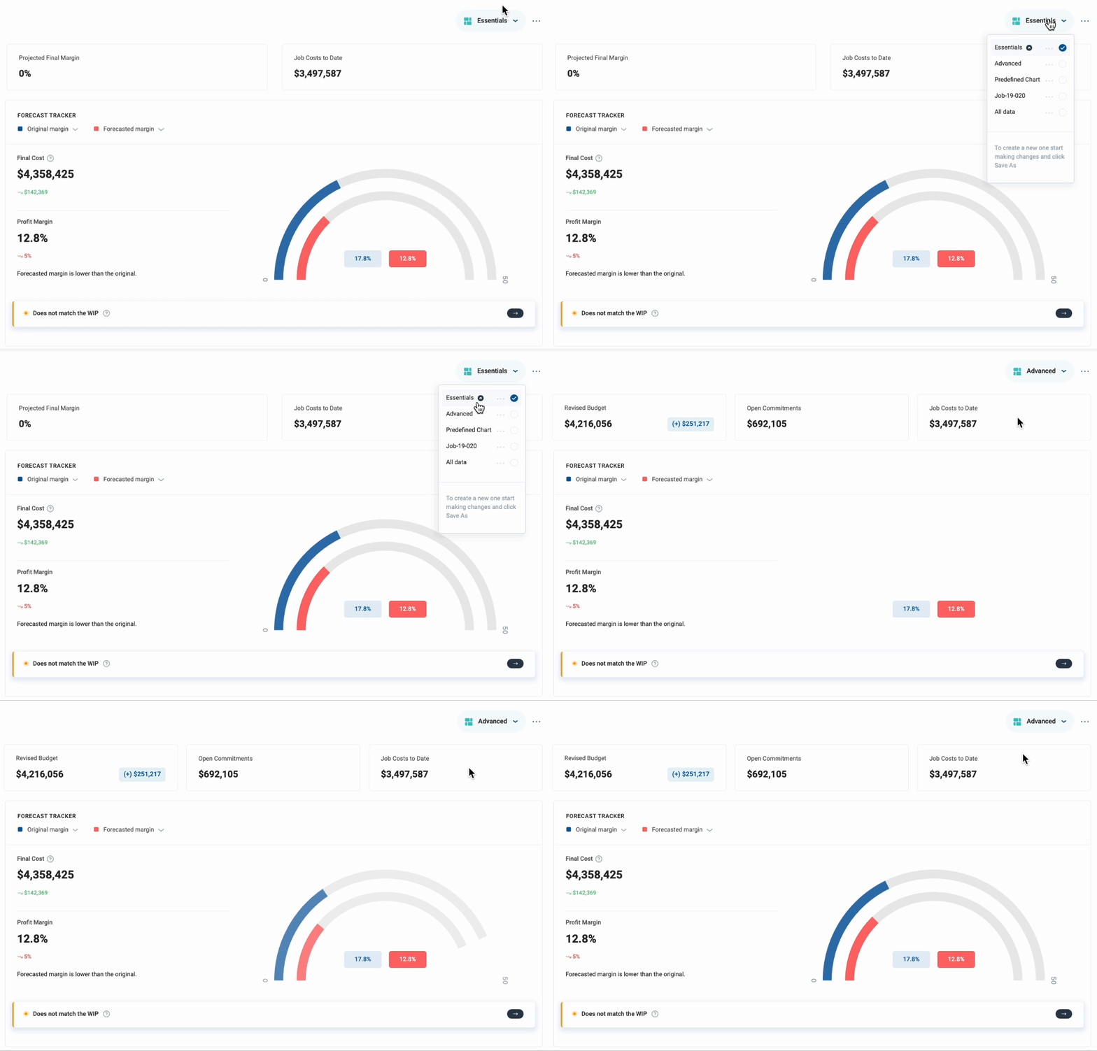
We developed the concept of a feature that would allow users to change or reorder visuals on the screen after receiving multiple requests to add or remove certain charts, as well as being able to save a specific view with the applied filters to be able to quickly access the same setup at any point.

When the opportunity arose, we used it to address both requests. Initially, we combined two pieces of functionality:

    • Workspaces: The section where all saved dashboard versions are stored, allowing users to rename, delete, or switch between them.
    • Layout: The feature that manages the appearance of an active workspace, enabling editing mode for users to organize, delete, or add new KPIs and visualizations.

Early feedback after the launch in the WIP indicated slight confusion regarding what workspace a user is currently on while using or editing it. The terms “workspace” and “layout” were also found to be too similar in meaning, leading to inevitable misunderstandings. The layout dropdown also included only one option — edit — making it logical to eliminate an unnecessary click required to access editing features.

So, we divided the functionality into two parts. Now, the name of the workspace you are currently on is displayed in the top right corner of the screen, making it easier to navigate between different versions. This is where a user can also assign which version they prefer to see as a “home” one — this is the one that will open by default every time they access the module.

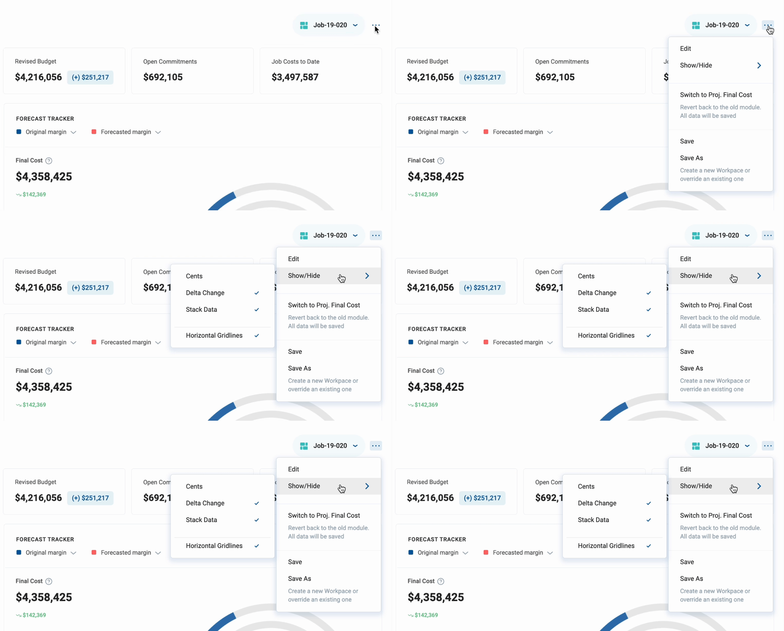
All design-related features now live in a dedicated container adjacent to the workspaces. To increase the platform’s flexibility, we added a “Show/Hide” feature, enabling users to display or hide specific UI elements to enhance their experience.

Excelsior! Sans MS Excel

We’re not trying to reinvent the wheel with how our clients do their jobs—MS Excel already perfected updating large data tables long ago. So, we updated Cost Forecast’s breakdown table to align with familiar actions and shortcuts we all use almost intuitively:

↵ Enter saves a value and moves to the cell below in the same column.

⇥ Tab saves a value and moves to the next editable cell in the same row.

⎋ Esc exits a cell without saving.

These updates will reduce clicks and save time, making multiple adjustments in a single session much more efficient.

Column Editor

First seen in the WIP module, we added the ability to add, remove, and reshuffle columns in any quantity and order users prefer to see their information to the Projected Final Cost. This change, now seeming like such an obvious feature, was not so clear at the time. See, at ProNovos we believe it is our job to define what tools are the most valuable for the users to use and explain how to use them to extract the most value. But with such a wide range of projects contractors manage in ProNovos — from quick service jobs to multi-million complex builds — it is impossible to have a solution that fits the needs of any project, big or small.

The column editor also made it easier to build an entire metric library. We do not gatekeep insights — any time a user requests another metric to be added as a column option, we include it in the library and make it available to all users. Each column comes with a description explaining its concept and the calculation behind it.

Forecast vs projection

After releasing the Projected Final Cost module, we encountered a significant issue: we hadn’t clearly communicated that its primary function was forecasting. This means the what-if scenarios and adjustments made by a user remain within the module unless they manually get pushed back into the WIP.

This oversight led to confusion among our users and, quite frankly, sometimes among ourselves too. How could the projected final cost in the module not match the projected final cost in the WIP? Weren’t they supposed to be the same?

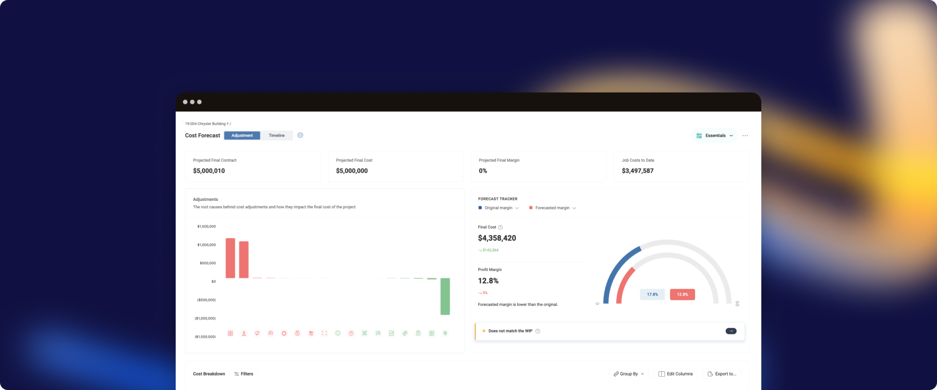
The answer is no, they are not the same, which led us to the decision to rename the module to “Cost Forecast” to get this message across. The change is intended to clarify the distinction between forecasted and projected costs:

• Projected Final Cost: The “official” final cost estimate that gets recorded in the WIP.

• Forecasted Final Cost: A preliminary final cost value calculated based on adjustments entered in the Cost Forecast module.

These two values can exist independently of each other, or the WIP can be updated with the forecasted value calculated in the Cost Forecast module. We made it easier to do the latter by adding an alert ribbon to inform users of any discrepancies between the two values, allowing them to update the Projected Final Cost value in the WIP without leaving the Cost Forecast module.

With this enhancement, we aim to streamline the forecasting process, reducing confusion and ensuring that users can easily maintain coherence between their forecasting activities and “official” financial projections.

Better, faster, stronger, our work is never over

Looking back on the process of developing the Projected Final Cost, now called the Cost Forecast, I would say we have come a long way. We started with the simple goal of making it easier for contractors to see their costs and make informed decisions quickly. From the start, our mission has been about giving contractors tools that really help, based on our belief in the power of data.

Changing from a one-screen-fits-all to customizable workspaces, adding a way to arrange columns, and making a clear distinction between forecasted and projected costs — all these steps were about making experience better for contractors. We listened to our users, learned from them, and kept tweaking the platform to serve them better.

Taking a change on the Cost Forecast tool was a big deal for us. It was our bet on doing something new and useful for construction financial management, and it has been great to see how well it has worked out. The success of this feature, shown by how many clients are using it and giving us feedback, makes us glad we decided to try developing something actionable.

This whole process has been about working together with you, learning from each other, and making our product better. As we keep going, our main goal has not changed: we want to keep pushing, keep improving, and keep making tools that help our users.