fbpx

Published January 30, 2025 . 2 mins read

Not another Directory update?!

At ProNovos, we’re always looking for ways to make construction data more accessible, intuitive, and — dare we say — enjoyable to use. Today, our Directory page (once again!) got a serious overhaul, and while the updates may look simple on the surface, each design decision was driven by real user challenges.

Let’s walk through what changed, why we made those changes, and how they make managing people in ProNovos smoother than ever.

Xenia Leshchenko
Product Designer,
ProNovos

A Directory that wasn’t working hard enough

The Directory (previously called “Contacts”) was meant to be a central hub for managing people — users, vendors, subcontractors, and other stakeholders. But over time, we noticed a few key issues:

1. As ProNovos evolved, other modules (like WIP, AR Collections, and Cost Forecast) received UI updates, but the Directory was stuck in the past. It looked and felt like an entirely different part of the platform, which disrupted the user experience.

2. Every user had different priorities, but the rigid table structure forced everyone to see the same data, whether it was useful to them or not.

3. Making changes to users and contacts required navigating multiple menus. Basic actions, like updating access or removing a contact, were more complicated than they needed to be.

4. Clicking a name didn’t take you anywhere useful. Users wanted to see a full profile with relevant details, but instead, they got… nothing.

Armed with this feedback, we set out to build a Directory that actually worked the way our users needed it to.

Twinning

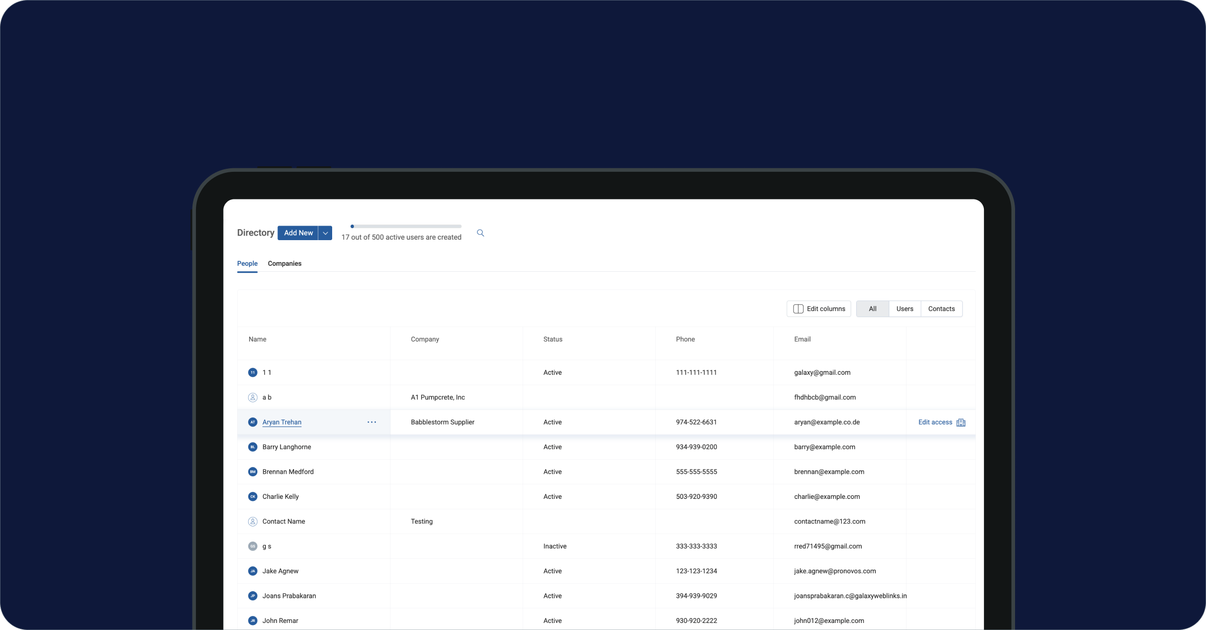
First, we brought the Directory in line with our latest UI updates. Now, it matches WIP, AR Collections, and Cost Forecast, creating a seamless experience across the platform. A consistent design isn’t just about aesthetics. It reduces cognitive load. Users don’t have to “relearn” how to navigate different parts of the system.

One size never fits all

Previously, users had to wade through every available data point, even if they only needed a handful of them. Now, you can edit your view, hiding irrelevant columns and focusing only on the information that matters to you.

This change was inspired by how power users and project teams interact with data differently. A PM might care about subcontractor contact info, while the admin wants permission details. Instead of forcing everyone into the same rigid structure, we put control back in the user’s hands.

3 dots, all the links

User and contact management is now housed in the “three dot” menu that appears when you hover over a name. This wasn’t just a design tweak — it was a fundamental shift in how we think about user interactions.

Just yesterday, managing people in ProNovos required multiple steps and scattered menus. By consolidating actions in one place, we reduced the number of clicks required and made the process far more intuitive. Now, whether you’re adjusting access or updating contact info, it’s all just a hover and a click away.

A blank slate for the future

Every user and contact now has their own page, something that was noticeably missing before. Right now, these pages might look a little empty. Rather than guess what information would be most useful, we’re leaving space for meaningful additions based on user feedback.

Our goal is to make these pages a true hub for all relevant details about a person’s role, access, and activity within ProNovos. But we don’t want to fill them with unnecessary clutter. So, what would help you most? More access control details? Activity logs? Notes? Let us know — we’re building this together.

With these updates, the Directory is no longer just a list of names. It’s a powerful, flexible tool for managing people in your construction business. From improved navigation to more control over what you see, every change was designed to make your workflow smoother and more efficient.