

We work with contractors daily on how best to take advantage of the data that’s locked up in their accounting systems and ERPs.
The initial conversations are almost always about building specific reports and drilling down to the transactions. I acknowledge that this is very useful and I encourage them to ask as many questions of the data as possible. I also nudge them to think of their data in a different way.
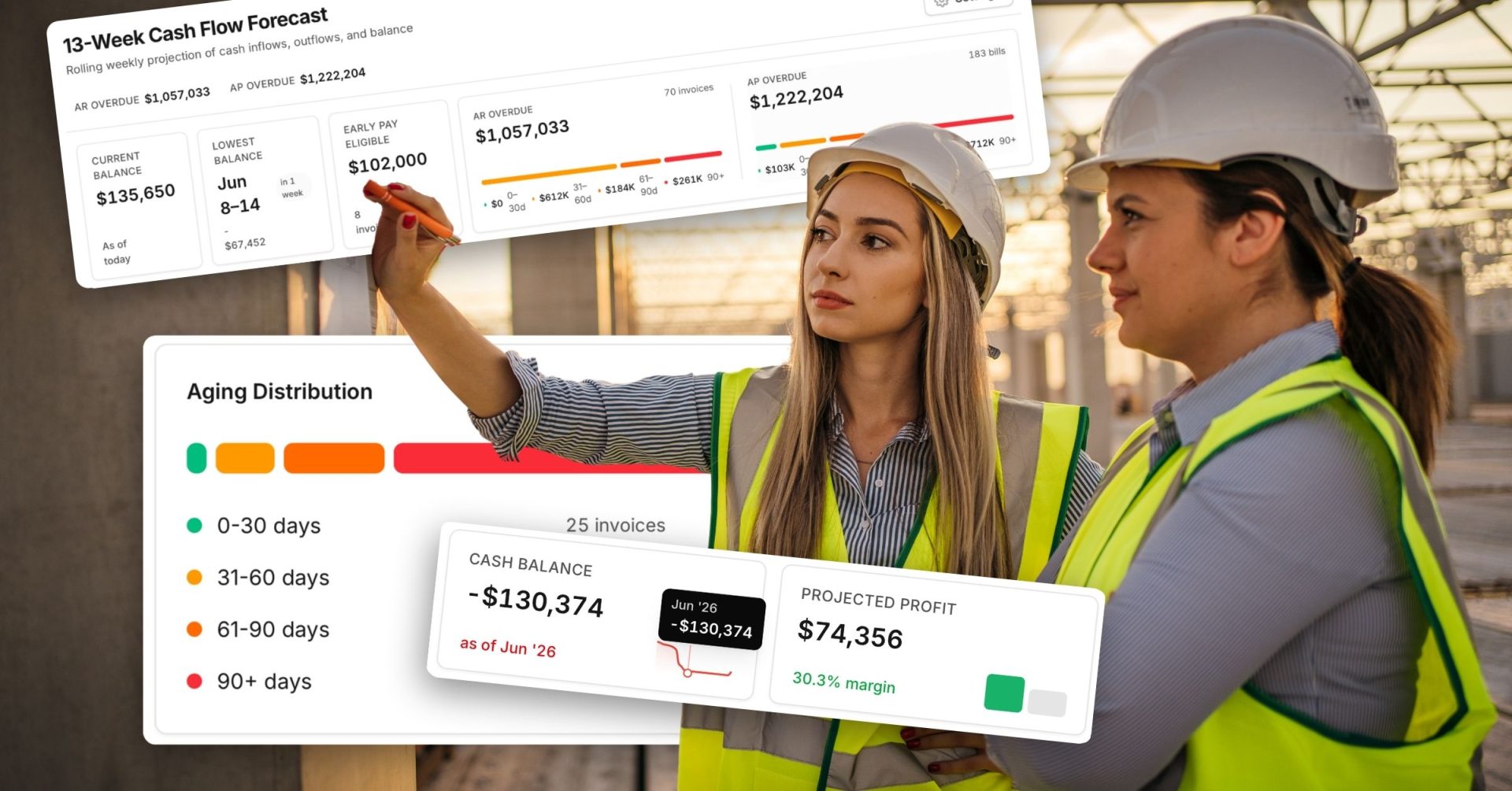
From my perspective, everything is about context. Let’s take job cost data as an example. You might consider all of the different ways your job cost data can be viewed. Here are a few common examples:
- Organizational
- Regional
- State
- Project Manager
- Vendors & Subcontractors
- Individual Jobs
- Cost Codes
Timing around job cost is also very important. Most contractors care about the current JTD (Job-To-Date) costs. However, being able to see the cost over time also provides great insight. Here are a few examples of adding the Time context to job cost.
- Do you spend more during the summer months vs. other seasons? This is an interesting one because it has implications on future estimates.
- Are you spending money on material and equipment too early on jobs?
- How are you performing year over year, quarter over quarter or month over month?
Everything so far has really been about exploratory analysis. We perform this analysis to gain understanding and to also figure out what is noteworthy so that we can communicate our findings to others. Exploratory analysis is important, but can be very time consuming. However, if we want to tell a compelling visual story to executives, then sometimes we might need to include narrative analysis.
Narrative analysis should be clearly articulated to your audience and action oriented. When creating a really good analytical visual, ask yourself what would a successful outcome look like? What do you want the audience to understand about the job(s)?
")